
Product Designer
LendingCrowd began a redesign of its entire platform with the vision of becoming the biggest P2P bank in the UK.
Product Designer – Product Lead. User Research, Interaction, Visual Design, Prototyping & Testing Dec 2018 – Nov 2020.
The goal of this particular project was to identify any usability issues on the borrower part of the platform and determine the critical features to prioritize for the next iteration of the product.
LendingCrowd is a fast-growing fintech lending platform. They fund ambitions and enable British businesses to grow by connecting them with lenders seeking a better return on their money. Learn more about LendingCrowd.
I joined LendingCrowd the first days of December 2018 as their Product Designer – Product Lead. While being a part of the tech team I worked with front end – back end developers, project manager and various stakeholders to support design across every aspect of their business and I was responsible for leading UX and UI across key parts of the application side of the platform.
I developed skills which grew tremendously during my time as their Product Designer, some of my key achievements are listed below:
The process at LendingCrowd was based on the Double Diamond Theory and Lean UX process. I aimed to incorporate the key phases of Discovery, Definition, Ideation and Implementation in all of their projects.

Before LendingCrowd even hired a product designer, their platform was designed by a third party. This was created without any usability testing and had little consideration for the technical and product limitations on the scope of work.
I conducted research interviews with their primary users (product managers) to uncover any pain points that they were experiencing with the beta release. My research encompassed:
After collecting the recordings from the user interviews, I conducted affinity mapping with the project manager to identify the challenges the users encountered while using the platform. We grouped these problems under common themes and features in the platform.

I relied on a data-driven approach known as the severity framework to inform my process and list usability issues in order of priority. The framework helps to identify the severity score of a usability issue based on the following three variables:
Task criticality x impact x frequency = severity
I took the extra step of categorizing these problems into broader Epics to provide the Product manager and engineers with visibility into the key areas of the platform that needed to be addressed from a usability standpoint. This not only helped to prioritize usability issues in order of need but also helped to shape the product road-map.
Based on the user interviews conducted with 7 users on the existing platform, we found the following key issues:
Based on the above problems identified, I worked towards addressing these difficulties by coming up with potential solutions:
I quickly mocked up some basic wireframes to gather feedback from various stakeholders and the users on the overall layout and structure of the platform. This involved establishing a standardised visual hierarchy and layout for the future components.

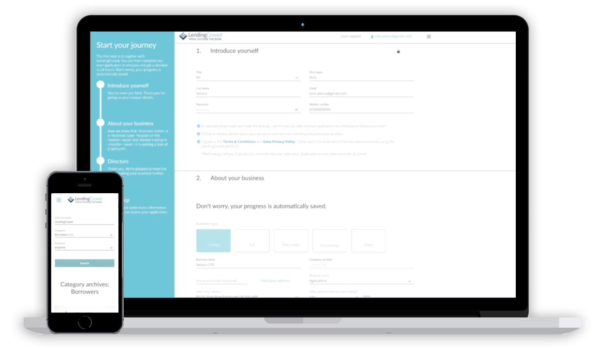
I conducted usability testing sessions with users to validate whether the new designs would solve their problems. I wrote a script including a scenario asking the user to complete the journey by borrowing money using both web browser and mobile devices.During the session, I observed how they interacted with the prototype. The usability session revealed that it was less arduous to secure a new loan due to the new UI and UX amends that were introduced. It was easier for the user to identify which forms they had to fill in and the automation UX amends made the process faster and safer.
I created my high fidelity mockups in Sketch and then imported them into Invision and Zeplin to allow the engineers to inspect the file and export the HTML and CSS code.
I worked very closely with the Front End team to spec out any missing interactions that were not covered in the high fidelity mockups. I conducted a UX review of each front-end ticket that was implemented to ensure it was aligned with the designs before it went live.
Since the implementation of the new rebuild of the Borrower side of the platform, there was a significant decrease in the number of complaints lodged through the service desk. Additionally, I received positive feedback from users about the simplified user journey, saving them a large amount of their time.
Some key take-aways from this project are:
Designed by Iordanis Chatzievgeniadis
-- Edinburgh 2017 --